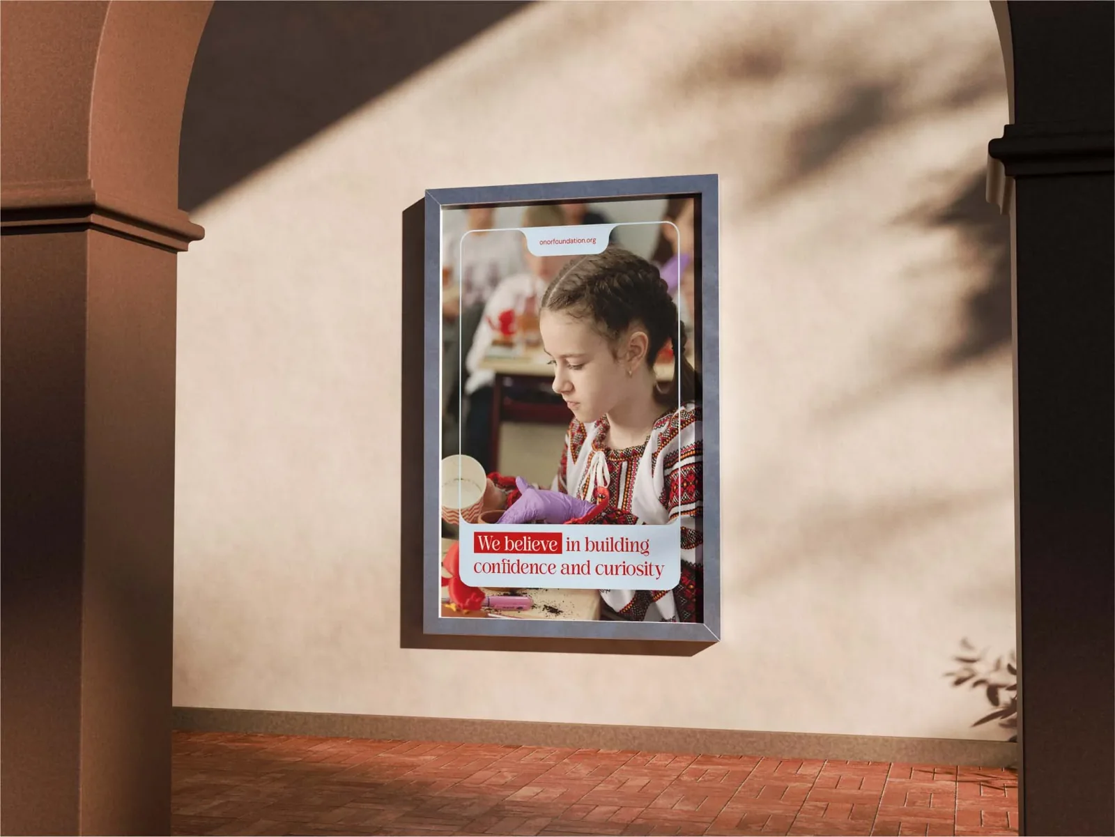
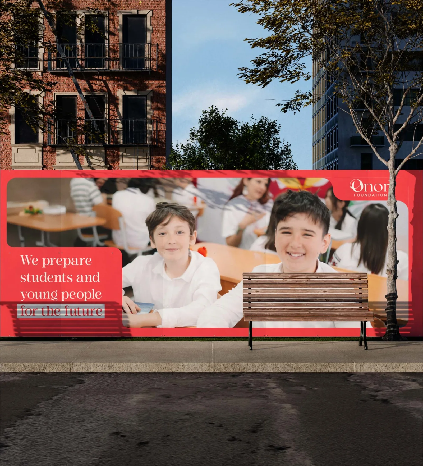
ONOR Foundation runs four education programs in California: Wings of Change, the Educator Academy, the ONOR Awards and the Global Summit. Before a new website launch, they asked for a full refresh of how the foundation looks.
What we had to solve
Each program was strong on its own, but together they looked like four different organisations. The system had to hold the programs, a podcast, a journal and a fundraising arm, and still be recognisable as one foundation at a glance.
What we noticed
Most education nonprofits talk about children through what they lack, and so they all start to look alike. We chose to talk about potential. A child is already a future scientist in motion. The foundation simply helps her get there faster.

How it came to life
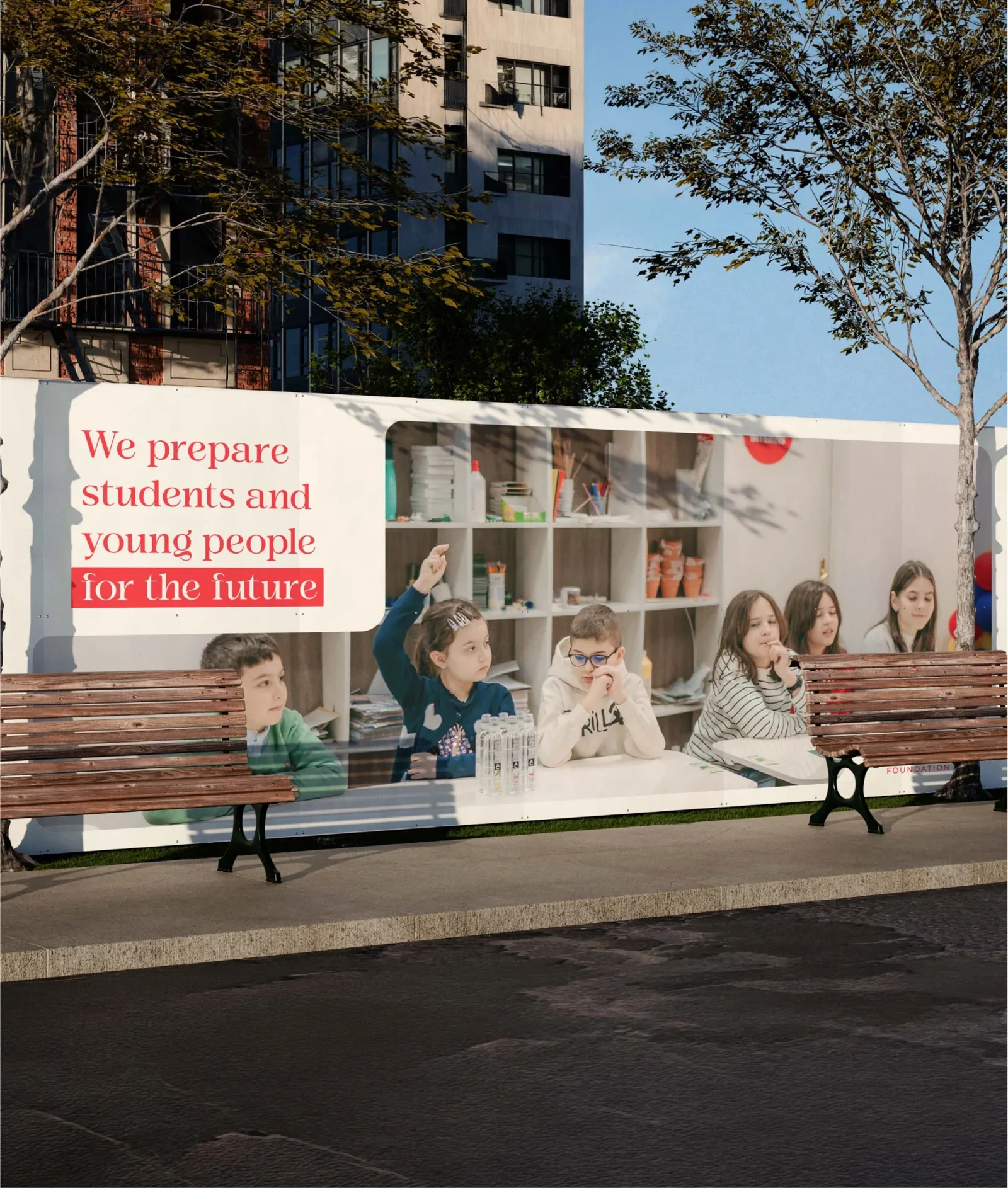
Rounded corners everywhere soften the institutional tone. A modular frame system gives each content pillar its own space without turning everything into the same template. One palette runs through all programs, so a classroom photo and a summit recap clearly come from the same place.
What changed
Programs that used to feel like separate accounts now share one visual language, and the foundation finally reads as one organisation across Instagram, decks and the new site.